


CSS Flexible Box Layout
CSS Flexible Box Layout, commonly known as Flexbox, is a CSS 3 web layout model. It is in the W3C's candidate recommendation (CR) stage. The flex layout allows responsive elements within a container to be automatically arranged depending on viewport (device screen) size.
Concepts
Most web pages are written in a combination of HTML (Hypertext Markup Language) and CSS (Cascading Style Sheets). In short, HTML specifies the content and logical structure of the page, while the CSS specifies how it looks: its colors, fonts, formatting, layout, and styling.
CSS flex-box layout is a particular way to specify the layout of HTML pages.
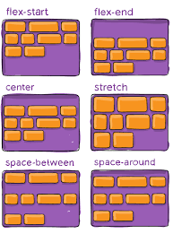
One of the most defining features of the flex layout is its ability to form-fit, based on its viewing environment. Flex boxes can adjust in size—either decreasing, to avoid unnecessarily monopolizing space, or increasing to make room for contents to fit within its boundaries. Moreover, the flex layout is less restrictive in terms of content flow than that of other CSS layout models, which are generally uni-directional. The flex directional flow can be specified rightwards, leftwards, upwards, or downwards. Individual items within a flex container may also be automatically rearranged to suit the available layout space.
History
In the 2000s the intensive use of the Web by mobile agents motivated "liquid layouts" and responsive elements for the growing variety of screen sizes. In the 2010s, the intensive use of popular JavaScript layout frameworks, such as Bootstrap, inspired CSS flex-box and grid layout specifications.
CSS 3 modules included solutions akin to this, like flexbox and grid.
As of September 2020, 98.69% of installed browsers (99.29% of desktop browsers and 100% of mobile browsers) support CSS Flexible Box Layout
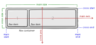
Terminology